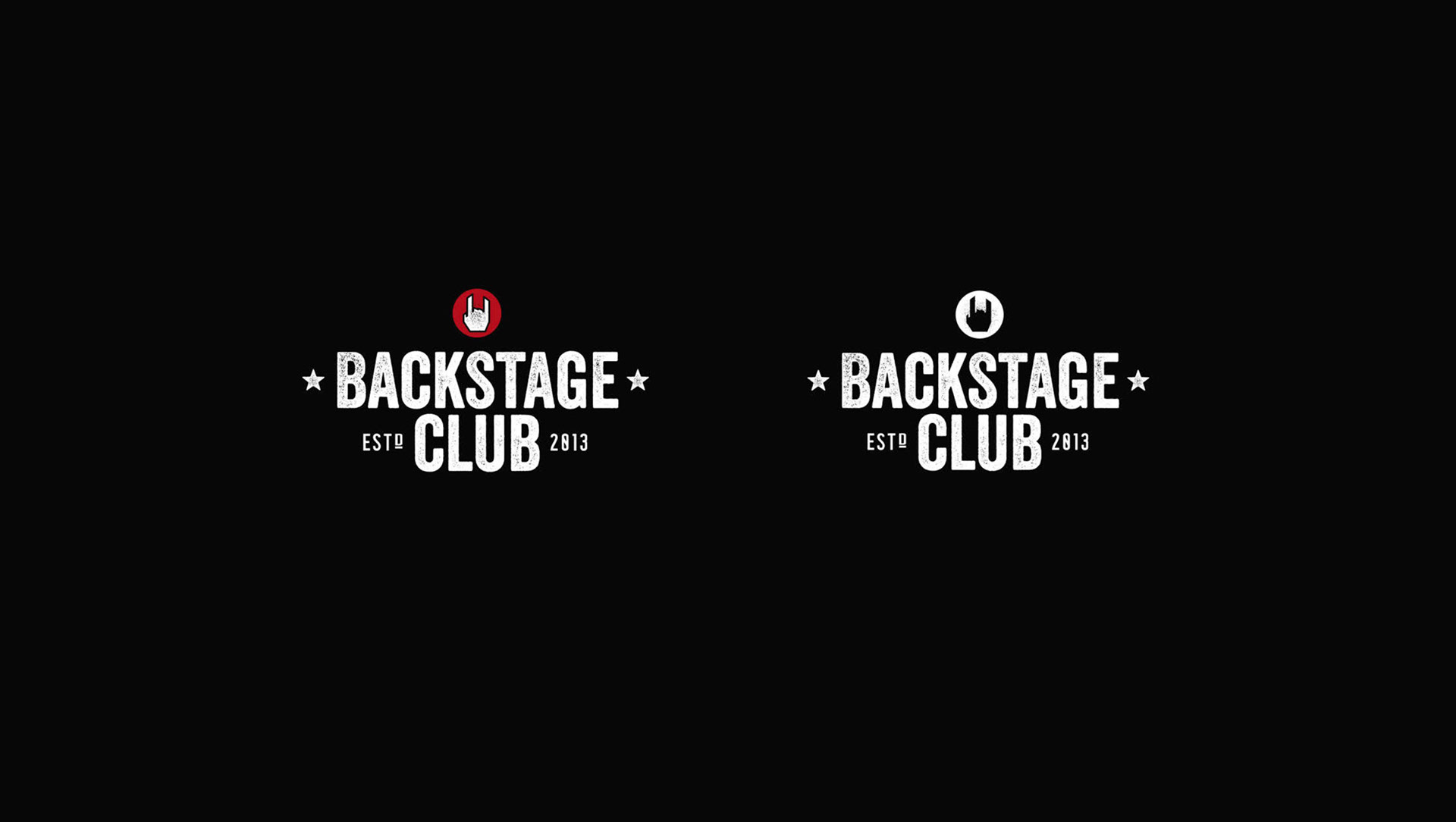
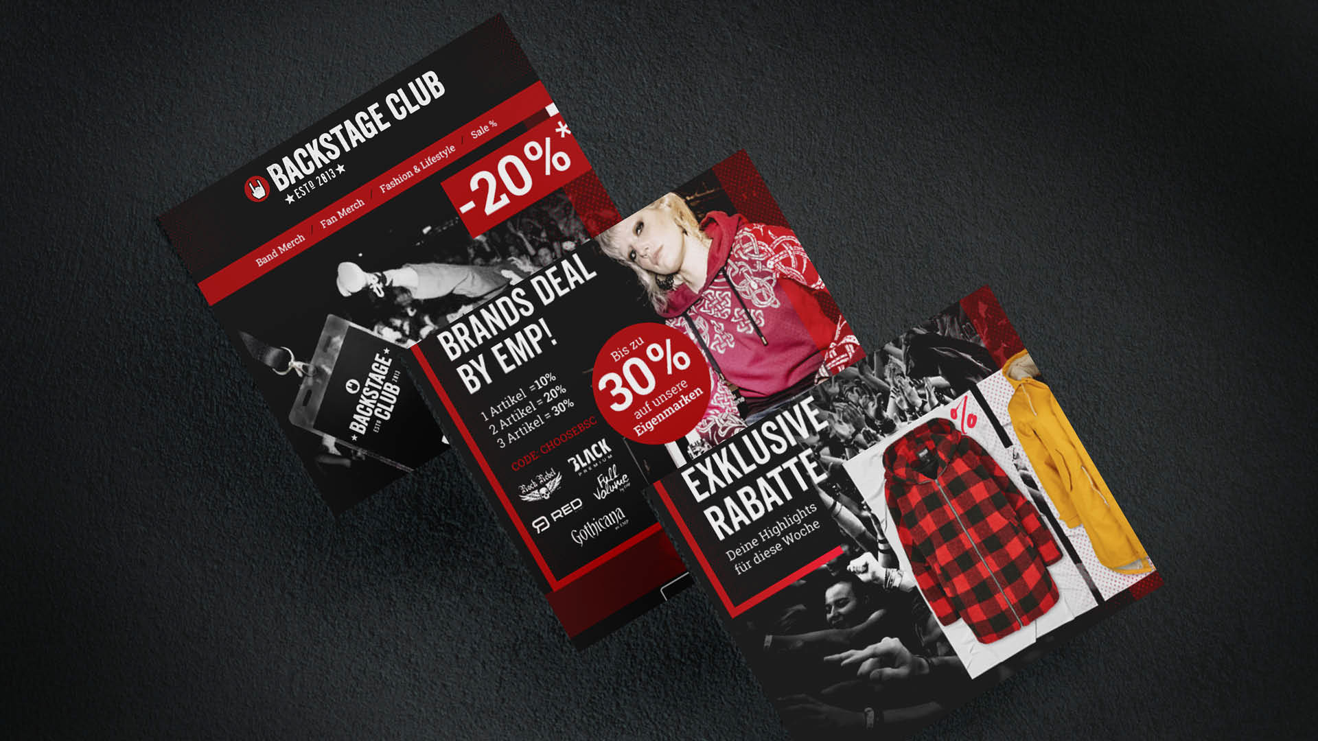
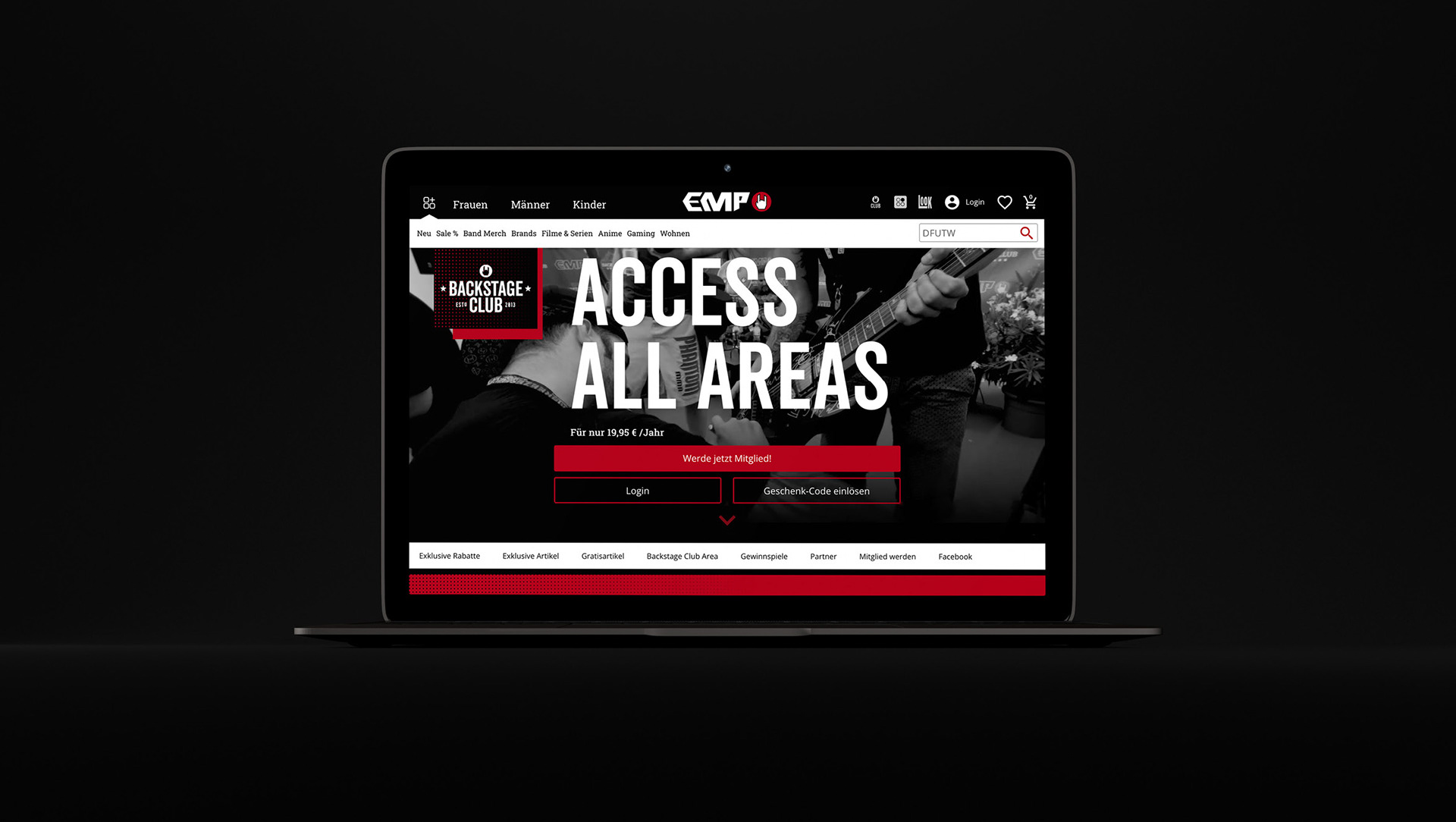
In diesem Projekt wurde das bestehende Design des Backstage Clubs einer kritischen Analyse unterzogen. Dabei stellte sich heraus, dass das ursprüngliche Design nicht eindeutig der Marke EMP zugeordnet werden konnte.
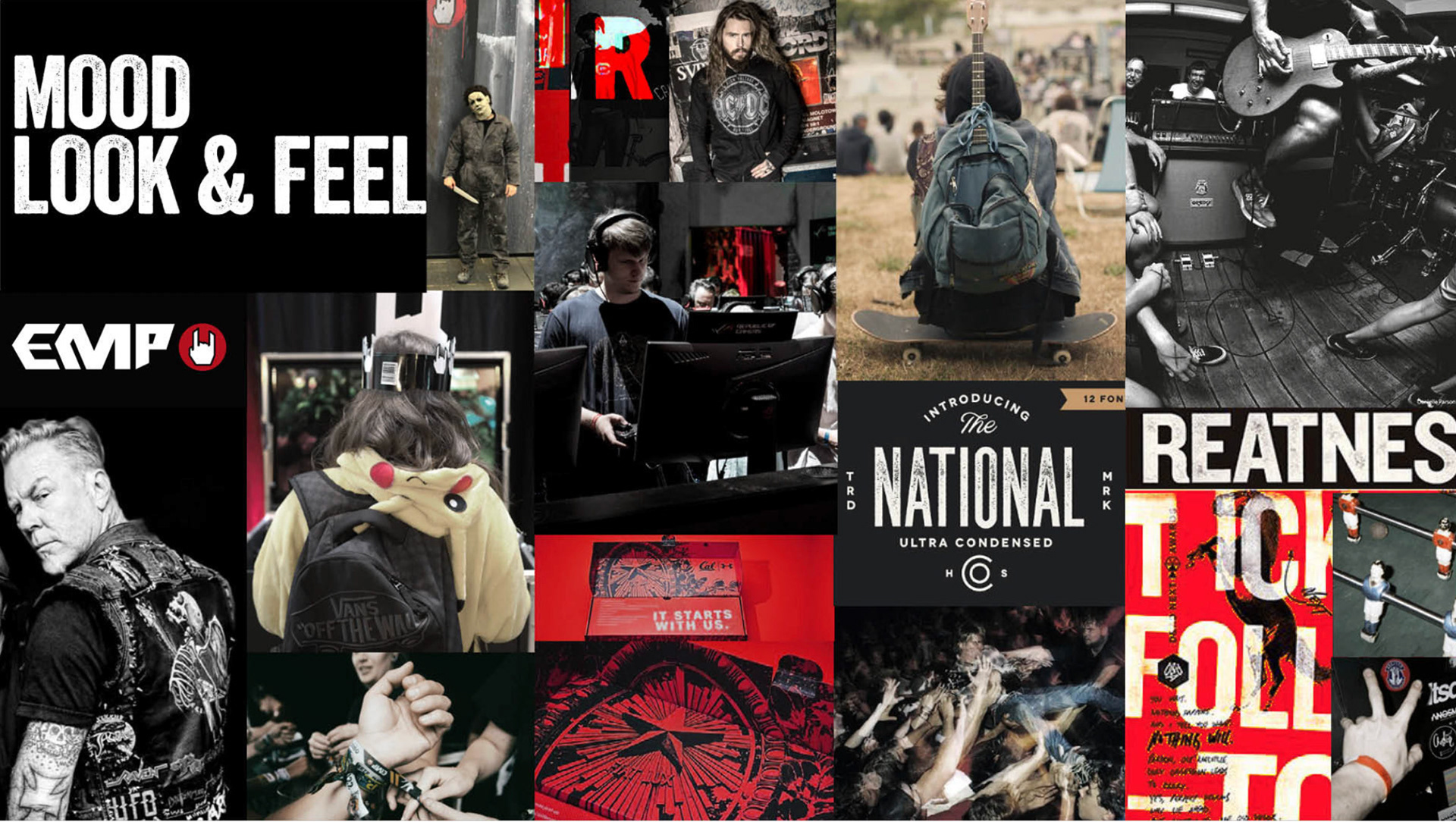
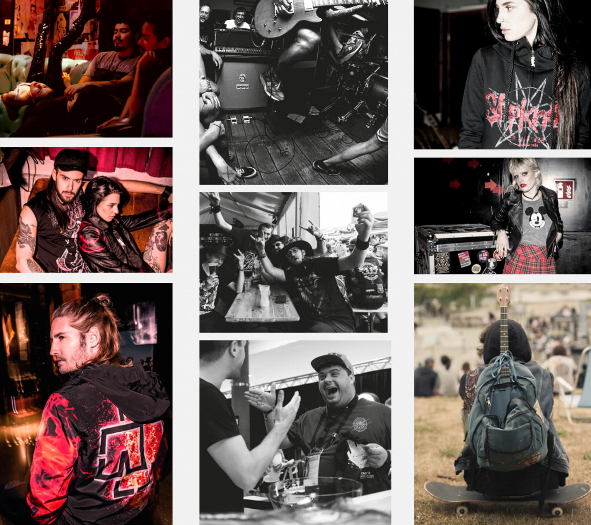
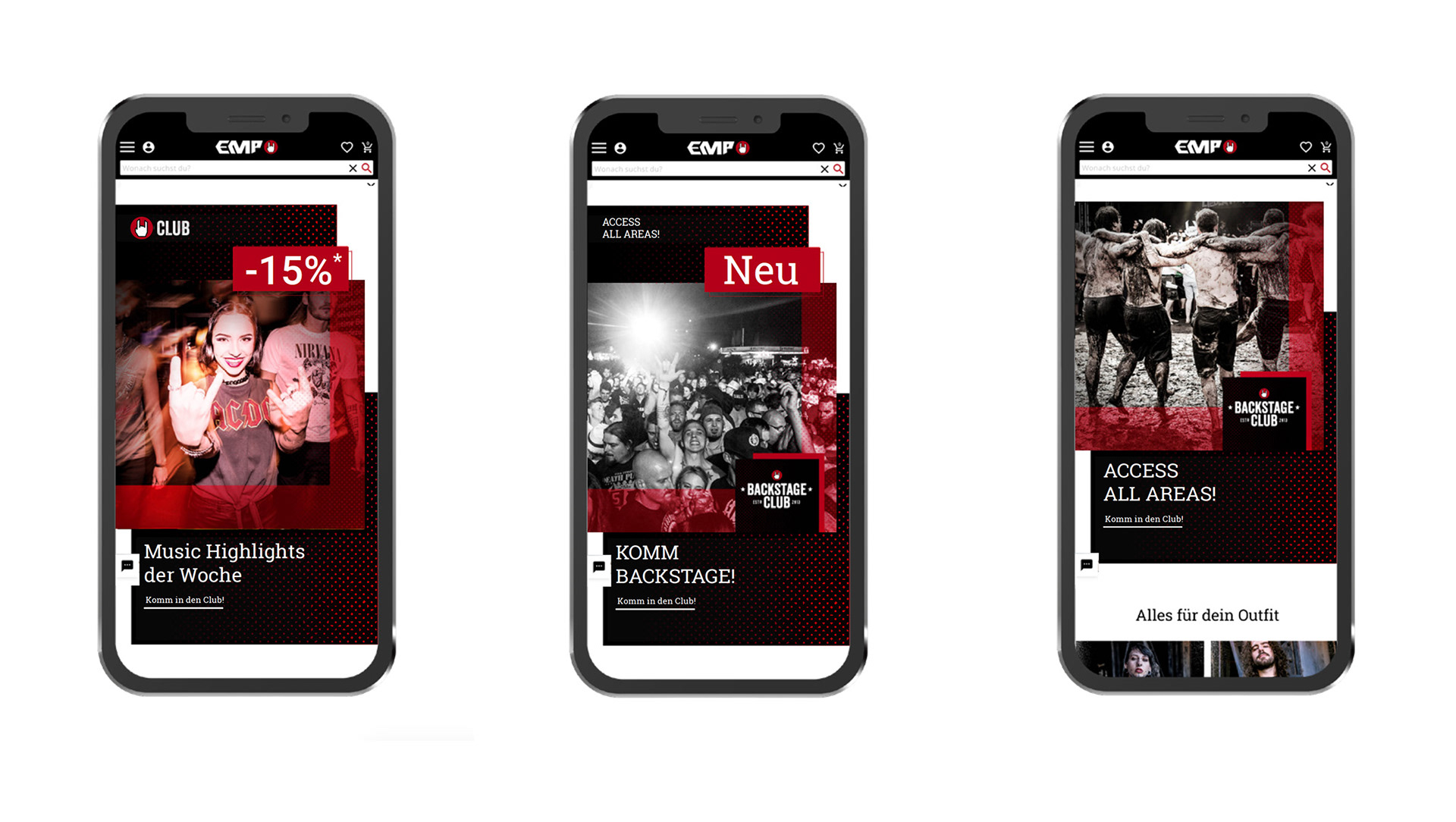
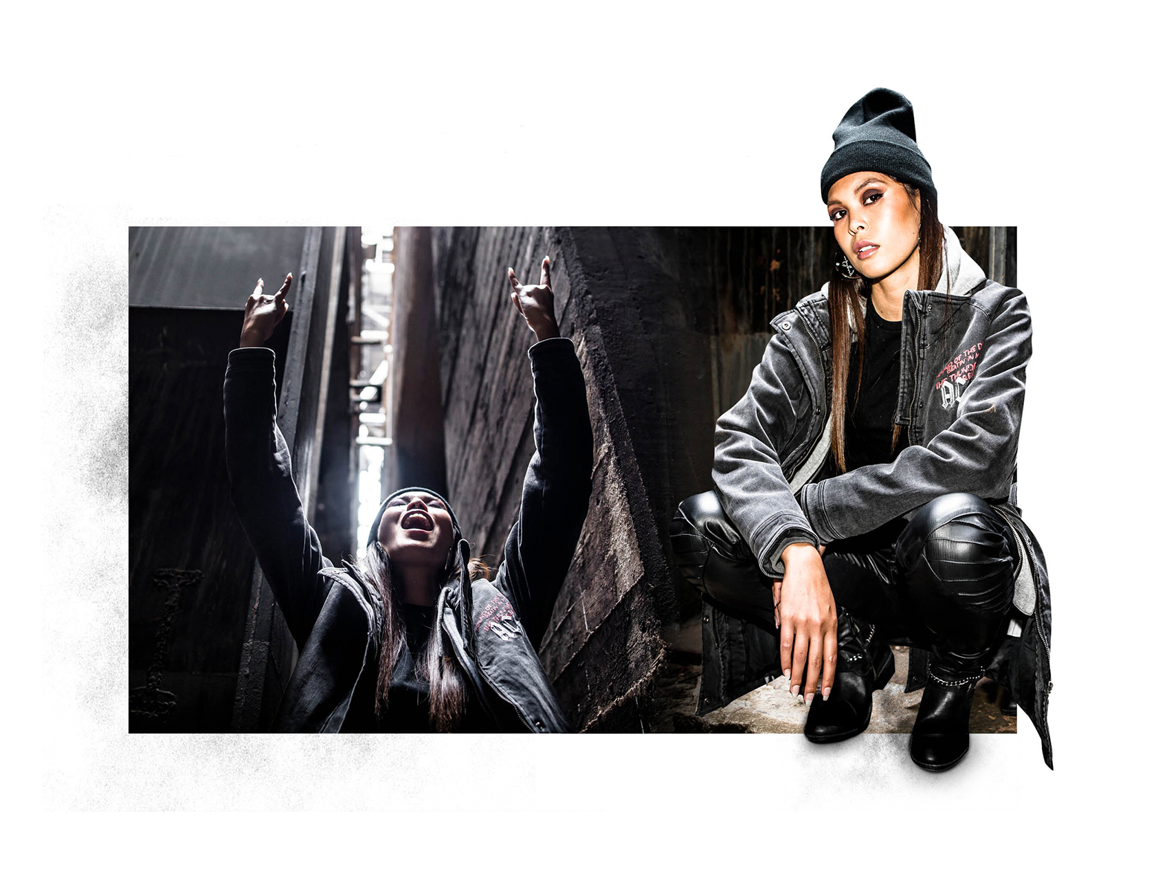
Deshalb habe ich das neue Corporate Design an die Kernzielgruppe von EMP angepasst. Auf diese Weise kann der BSC nun klar mit EMP in Verbindung gebracht werden. Das neue Design hebt den exklusiven Charakter des Clubs hervor. Die Bildwelten sind gezielt so gewählt, dass sie die Umgebungen widerspiegeln, in denen sich der BSC-Kunde "zuhause" fühlt – sei es in Clubs, auf Festivals und Gigs, "on the road" oder in der Zockerhöhle. Das stärkt die Identifikation der Kunden und spricht sie emotional an.
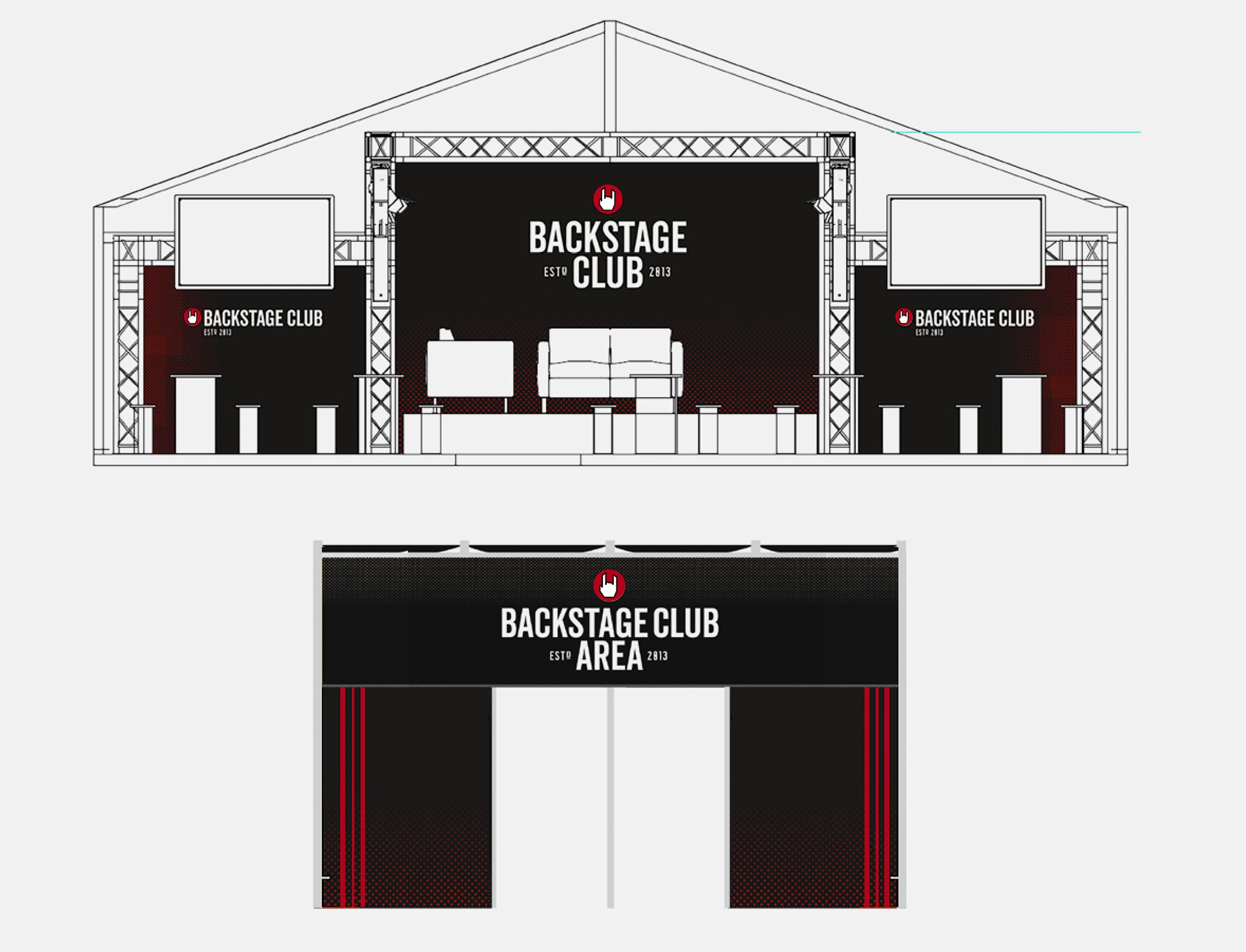
Das Redesign umfasst ein Bild- und Farbkonzept, basierend auf authentischen Bildwelten, Logo und Typografie, Teaser-Layouts, Newsletter und Landing Page. Zudem eine visuelle Umsetzung des neuen Corporate Design für Werbeartikel und die Back Stage Club Area auf Festivals.
In this project, the existing design of the Backstage Club was critically analyzed, revealing a key issue: The original design could not be clearly associated with the EMP brand. Therefore, I realigned the new corporate design more closely with the EMP core target group. This way, the BSC can once again be clearly associated with EMP. The new design also strengthens the exclusive character. The new visual worlds take place where the BSC customer 'feels at home' and connect with them emotionally, allowing loyal customers to identify with the Backstage Club. The redesign includes an image and color concept (based on authentic visual worlds), logo and typography, teaser layout, newsletter, landing page, and a visual implementation of the new corporate design for trade show stands and promotional items.